A high-converting landing page is all you need to generate leads and grow your sales online. It goes beyond designing a beautiful landing page, you also have to give people want they want.
Your landing page should be able to solve their problems.
A good landing page can generate 220% more leads than a typical web page, according to study Marketing Experiments.
In this article, you’ll discover how to not only design the best landing page that will attract your audience but will also help people become better in their businesses and life.
You believe in your product. You know it adds value to your customers.
You’ve tested the product on a handful of users and you just can’t get it into more hands. Savvy marketers send people to their landing pages first to capture their email address and build a level of trust before sending them to the sales page.
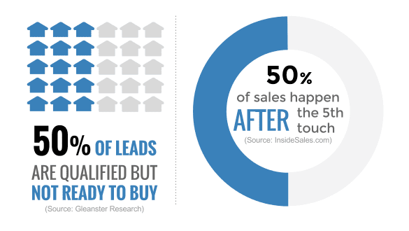
If you send them over to the product page and they don’t buy initially, how do you keep in touch with them? After all, 50% of the leads that come to your landing page are qualified but not ready to buy.
That’s the essence of a high-converting landing page. It’s the intermediary between your product and the customer.
When it comes to landing pages, there’s no fast rule that works for every industry and business model. Because the landing page that works for a PR agency will likely flop for an eCommerce business.
But knowing the fundamental steps can help you design landing pages that will appeal to your audience, regardless of the industry or project.
What is a Landing Page?
A landing page is a standalone page on your website. It’s designed to increase conversion rates and help you reach your business goals. Whenever you have a new product or service, or you want to segment your email lists properly, you should create a dedicated landing page for it.
A high-converting landing page is one that gets results.
Most businesses use their homepage as the landing page — and there’s nothing wrong about it. As long as the principles of a good landing page are followed when designing it.
But with the majority of our campaigns and clients’ campaigns, we like to design a standalone page to run each campaign. This tends to deliver higher conversions than using the homepage.
But it all depends on the industry or model — the rule isn’t set on a stone.
The advantage of using your homepage as your landing page is people will find you through word of mouth or social media.
But why is that? It’s easier to refer a potential customer to yoursite.com rather than yoursite.com/the-topic.
Standalone landing pages are mostly found organically when potential customers and users input relevant keywords into the search bar. They can also be referenced in a blog post.
5 Steps to Build High-Converting Landing Pages
That being said, here are the 5 steps you can take to build a high-converting landing page for your online campaigns:
Step #1: Craft Your Unique Selling Proposition (USP)
There’s no effective landing page without a USP. If you operate in a crowded niche, one of the things that can stand you out is a captivating USP.
It shines a spotlight on your business and encourage peoples to choose you over your competition.

Your USP isn’t about selling even if you see that word there. It’s about differentiation and uniqueness in business.
No, your business or product doesn’t have to be the best in the industry to stand out. Great products and content go a long way but they often don’t differentiate a business.
If you’re just getting started, there’s no way you can create a better product than the big businesses that were in the trenches long before you emerge.
So you don’t want to compete with product and content quality alone. That’s why you must not focus on everything to make a difference — but focusing on 1 thing can help your landing page to stand out.
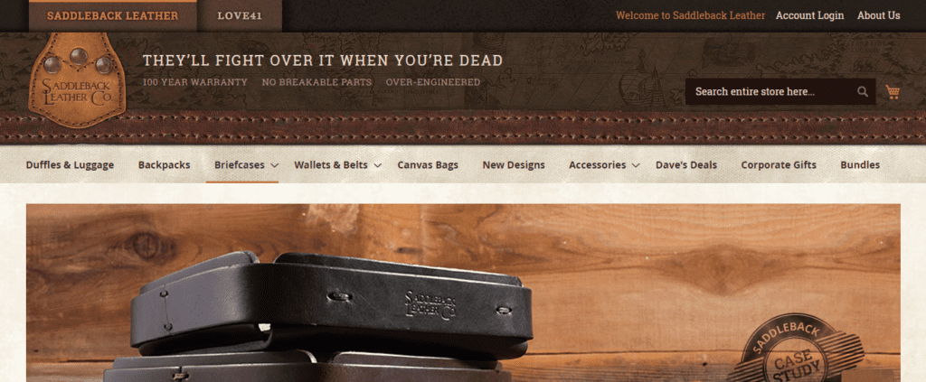
Saddleback Leather, an eCommerce store that sells leather belts, leather bags, and other leather products has a strong USP. It reads “They’ll fight over it when they’re dead.”
This shows that creating a landing page about ‘small business’ isn’t smart. But when the landing page has a Unique Selling Point that’s based around “help small businesses get investors,” now you’re talking.
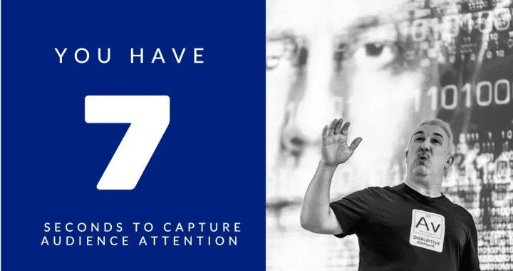
You have 7 seconds to grab someone’s attention when they visit your landing page. If the page isn’t relevant and interesting to go through, they’ll leave. So you need to impress them with plenty of value.
Once you’ve defined your value-driven USP, it’s time to weave it into your headline. Your headline is what ‘projects’ the value you have for the user. So make the headline pop.
When people read your headline, they should understand why you’re in business, what’s in it for them?
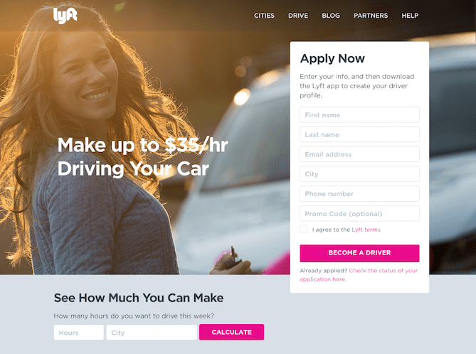
Lyft’s landing page has a strong Unique Value Proposition. It’s well incorporated into the headline “Make Up to $35/hr Driving Your Car.” Now users know that Lyft is in business to help them make money “with their car.”
So whichever approach you take, make sure you’re showing the ROI that can be achieved, stating what your offer can do, comparing your product against the competition, and even showing the transition from where people were before using your product and where they’re right now after using it.
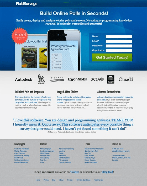
Here’s a high-converting landing page from FluidSurveys. The headline delivers a strong USP (build online polls) as well as a Value Proposition (in seconds)
Step #2: Adopt Clean and Simple Design
Your landing page has a specific objective: to get people excited about your offer and take action right now. You don’t want them to take action later, but now.
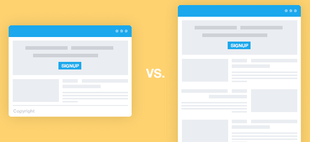
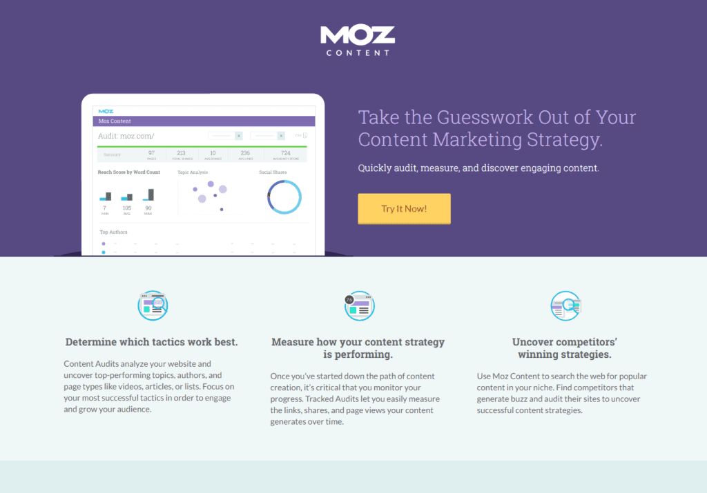
To achieve this feat, you must remove every form of distraction that will take the user’s attention away from your offer. Here’s a clean landing page from Moz:
Hence, it’s recommended to use a clean and simple design. Although this is subjective because what one business views as clean and simple may be cluttered for another business.
So in essence, you should design a landing page that doesn’t distract the user. Fair enough!
Use full width and height for the landing page. Completely remove the navigation features or use only a handful (2 – 3 menu buttons).
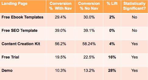
According to WordStream research, “96% of landing pages feature at least one link that leads prospects off the page.”
For the best results, get rid of navigation links on your landing page. Because it’ll take people away from the main offer — and they’ll probably never come back to your website.
HubSpot conducted an A/B test and found that removing navigation links increased conversions.
Allow plenty of white space on your design. This will give users a breathing space as they read your copy. It removes congestion in the brain and allows people to make better decisions. It also keeps the eye steady on your offer.
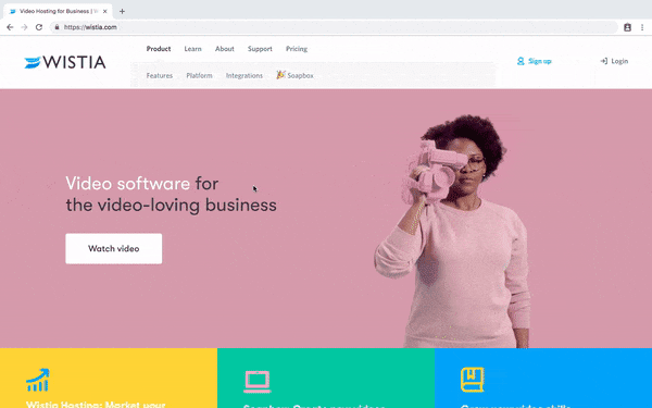
Even though Wistia uses an animated image on its landing page, it’s still clean and simple. More importantly, there’s plenty of white spaces (it doesn’t have to be white) on the page.
Step #3: Choose the Best Landing Page Builder
This is where it gets tricky because there are so many landing page builders online. So knowing which one to use could be a challenge.
I like to preview the landing page templates that a particular landing page builder has in its marketplace or archives before signing up.
After using several landing page builders, we can agree that the majority of them do the same thing.
But the one you choose in the end will depend on your goals, how experienced you are with designs, and whether or not your preferred landing page template is available.
For beginners, it’s best to start with the preloaded landing page templates. Choose a template and customizing it will simplify the whole process — and make it easier to get your high-converting landing page live in no time.
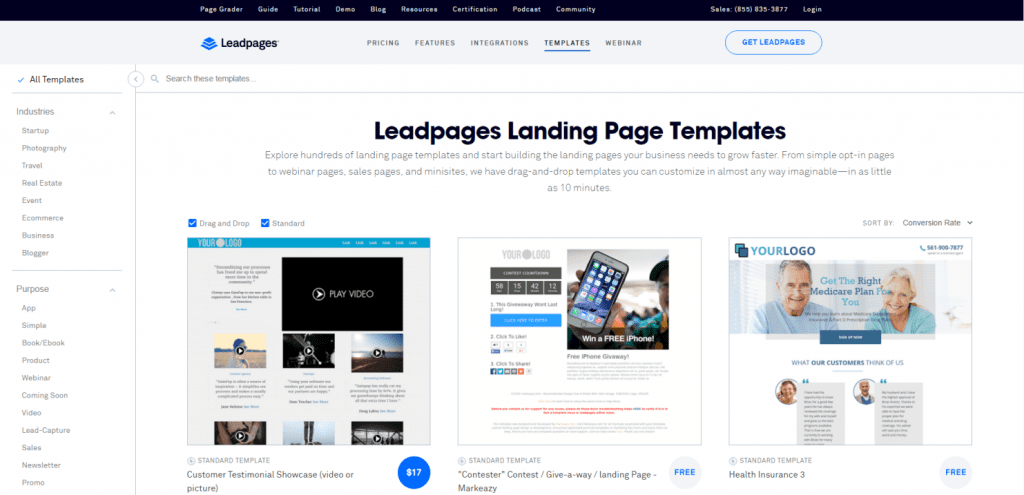
Also, make sure the landing page builder uses a drag-and-drop feature. And there are plenty of builders out there that offers this tool, such as Leadpages, Instapage, Unbounce, and the like.
Don’t forget the A/B split testing feature. This should be present in your landing page builder — because you’ll be conducting tests to determine what to adopt or discard.
You also need a good Analytics that will show how your landing page is performing, in terms of page views, click-through rate, scroll depth, opt-in rates, etc.
Step #4: Include a Social Proof
People want to do things they see others do. This is a fact of life. Sometimes, we play songs that our friend is talking about. We may not necessarily like the song, but we play it anyways. That’s the social proof influence.
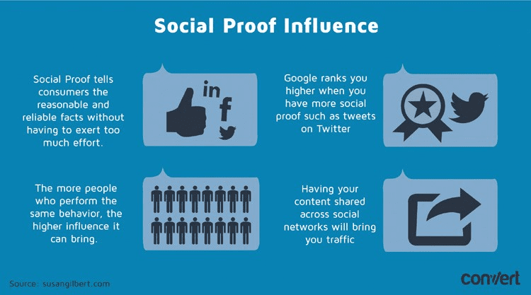
Why do people go to a particular restaurant? Sometimes, it’s because everyone is talking about it.
Social proof is a powerful concept you can include in your landing page. It may seem like a distraction but it’s effective.
Social proof is the phenomenon that motivates people to follow the actions of the masses. The notion is that since many people are attracted to a certain product, event, website, cause, or action, it must be the right thing to do.
Social proofs cut across several things. It includes the number of social shares, subscribers, tweets, likes, pins, recommendations, followers, etc. You need to display these ‘proofs’ prominently on your landing page.
Research by Hubspot shows that 71% of millennials are more likely to buy a product if it’s been recommended online.
Social media has become a powerful tool they rely on when making purchase decisions online. By simply displaying your big fan base or customer success stories can go a long way to increase conversion rates on your landing page.
If you choose to showcase testimonials instead of your social footprint, make sure you’re using real people. Using celebrities would seem fake.
The average guy wants to read testimonials from people like themselves. Don’t just include the testimonials, add their original pictures. Zapier displays customer testimonials with real photos on its landing page.
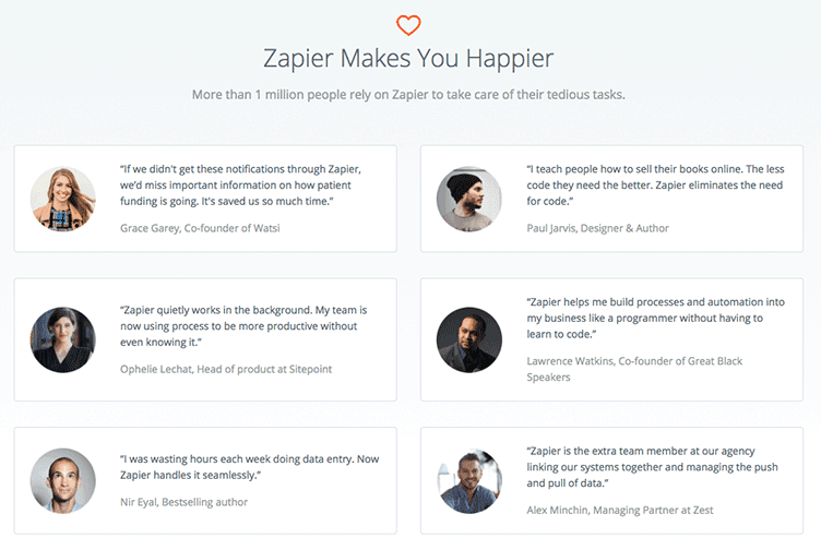
Don’t use stock photos or Mexican models, ask for permission to use your customers’ photos on your landing page.
9. Add a Catchy and Relevant Call-To-Action
One of the factors of a high-converting landing page is the call-to-action (CTA). It’s arguably the most important element you must include on your landing page.
Your CTA is what will drive conversions. Because if you’re giving away an eBook for free, for example, and you’re not capturing the users’ contact information, what difference does it make?
You can track conversions. But the CTA shows how many people took action after reading your copy. If they don’t click it, it means you have to do better with your offer or improve the CTA copy.
Follow these tips to make your call-to-action buttons clickable:
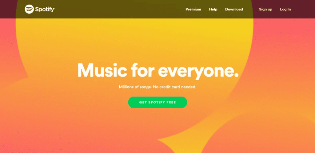
i). Be relevant: If you’re giving away a whitepaper that can help marketers prevent shopping cart abandonment, then your CTA must be relevant to that. Instead of using the default “Submit” you can use a more relevant trigger such as “Download a Copy Now.”
Tell people what they’re getting once they sign up or click the CTA button. Spotify says “Get Spotify Free” which is very relevant to the offer.
ii). Use big CTA buttons: Big is another subjective word but you know what that means. Make sure your CTA is clear enough. It should be bigger than the texts on the page — so that users can see and click on it.
iii). Make your copy compelling: Your CTA copy can draw people in — so make it the best. Instead of using the word “submit”, use something more persuasive and catchy. More importantly, it must be relevant to your offer.
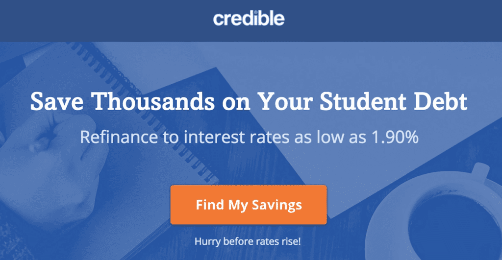
Credible is all about savings on student debt. So the call-to-action has to be compelling enough for people to click. I’m sure that’s why they used “Find My Savings” in the CTA button to increase clicks.
iv). Use a button: Yes, the call-to-action can be a link but for your landing page, make it a button. Most people are already familiar with buttons. Don’t try to reinvent the wheel. Stick to what’s working right now — people are trained to click on a button. So use it.
Whatever you do on your landing page, make sure your CTA button stands out on the page. This isn’t AdSense — so don’t try to blend it in.
If you can, use a directional cue to steer people’s eyes to the call-to-action button. A direction cue will guide users properly and deliver a better user experience at the end of the day.
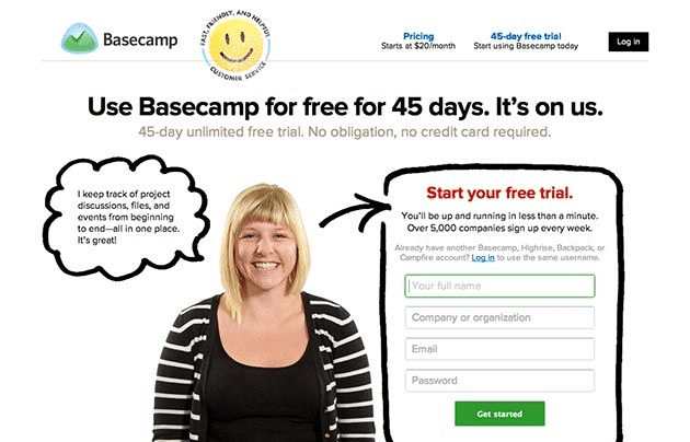
In the landing page example below, the happy lady is steering at the form. That’s a form of prompt to the user to fill out the form.
Basecamp uses ab arrow to give the user a direction. See for yourself:
Here’s another example to give you more inspiration about the best practices for your landing page form and CTA button.
Conclusion
Using landing pages for online campaigns isn’t new. Google advertisers usually send ad clicks to their landing pages to capture prospects’ names and email addresses before sending them to the sales page.
This helps them to maximize ROI.
But these days, bloggers, online course creators, SaaS companies, local businesses, and even brick-and-mortar businesses use it when running online campaigns.
Remember to add a lot of value when people opt-in to access your lead magnet (i.e., what you’re giving away for free on your landing page). Reward them with good content that’s tailored to their needs.
Your landing page can be the lifeblood of your online business if you know what you’re doing.
It’s time to start building as many landing pages as possible — because studies show that 48% of marketers build a new landing page for a new campaign.
If you don’t know where to start or how to nail the perfect landing page for your next online campaign, we can help. Contact us today.