Website design matters!
If you want to boost conversions on your website, you need to be deliberate with every aspect of your web design.
In this post, you’ll discover 11 effective web design strategies that will make all of the difference in the number of leads you generate, product sales, and repeat readers you attract.
In the online marketing space, we all get excited about lead generation, content marketing, and paid ads. Web design is only an afterthought — but it shouldn’t be so.
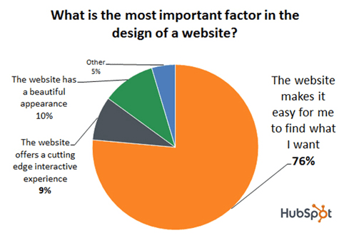
Are you making it easy for 76% of people to find exactly what they’re looking for on your website? That should be the ultimate pursuit of your web design — so the appearance, layout, color, style, and experience must be geared towards this ‘pursuit.’
A study conducted by Stanford University shows that 46.1% of people regard a website’s design as the top criteria for deciding the credibility of a website. So whether they choose to click the back button on their browser or stick around depends on the design of the website.
The content on the page is secondary — it only becomes a factor after the design is sorted.
The average website conversion rate is 2.35%. Therefore, you constantly need to improve your conversions. That’s why you created a website in the first place, right?
So let’s forget about Facebook ads, guest blogging, native ads, or Google Ads.
Apply these 11 strategies to optimize your website design and boost it conversions:
1. Use Negative Space
Modern web designs incorporate lots of negative spaces. Strategic white spaces can increase reading comprehension by 20%, according to Smashing Magazine.
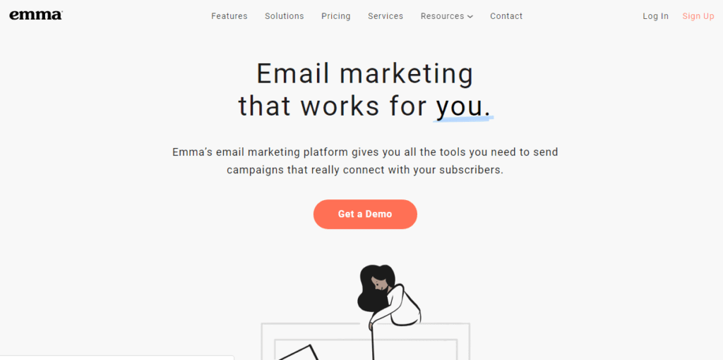
This is often referred to as white space — but the confusion is that many people think the ‘space’ has to be white. But it can be any solid color. MyEmma, an email marketing provider uses plenty of ‘white’ negative space.
While positive space is that space that houses all the elements of your website, the negative space consists of the empty spaces between the texts, images, and other elements on the page.
As awful as the term may sound, negative space is important because it creates a breathing space that makes your site readable, relatable, and beautiful.
When designing your website or providing a brief for a web design company, make sure they leave a lot of spaces between the header and your content, between the sidebar and the main content page, and there should be spaces between your paragraphs, lines of texts, and so on.
You can greatly improve conversions on your website by eliminating distractions on your page and allowing plenty of white spaces.
2. Use Bold and Readable Typography
Using different font styles and writing styles can help you connect better with your audience. People love to read a clean website that doesn’t hurt the eyes. So make sure the swirly fonts don’t get in the way.
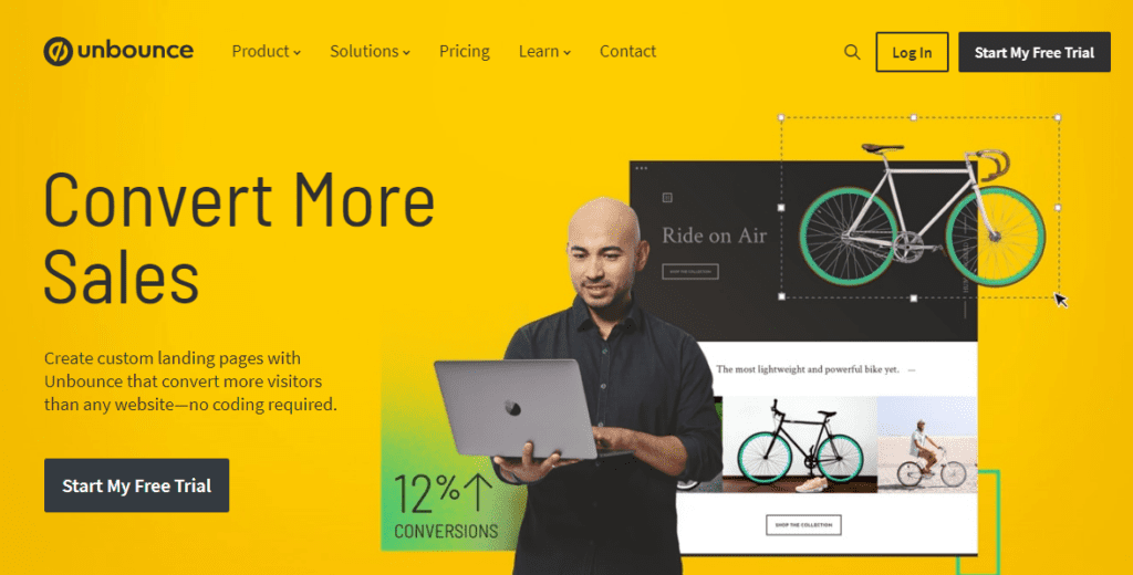
We see a lot of typography trends in web design, such as the use of bold and big fonts. This trend will likely continue as the years go by. Unbounce uses clean and bold fonts on its homepage.
With the right typography, you can boost your brand. Most of the time, all you need to communicate your message better is a simple and elegant body font. Simple fonts are easy on the eyes and fun to read.
Your homepage, for example, is the first portal that most of your visitors will first discover your brand. So you need to optimize your typography so it draws people in.
Avoid boring fonts that depreciate the quality of your content and the value that your brand brings to the marketplace.
A good combination of big and bold fonts coupled with engaging website content can increase your chances of converting visitors into email subscribers and leads.
3. Pay Attention to SEO
Search Engine Optimization (SEO) is the practice of optimizing (to make ready) your web pages to be visible on the organic search results.
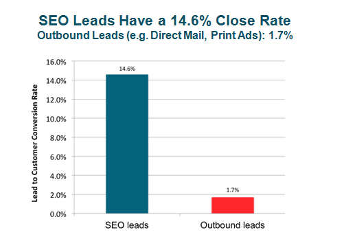
SEO alone can drive up to a 14.6% conversion rate to your business, once your website is properly optimized.
Google, for example, is a powerful search engine that crawls the entire web looking for new pages and fresh content. And because Google ranks web pages (not websites), you’ve got to look beyond the homepage.
Your inner pages are important and should be optimized for SEO as well. If you’re a healthcare company, then your services/product pages must have a set of keywords they’re targeting.
In SEO, it’s better to be relevant than being creative. In other words, don’t use fancy terms that people are not searching for.
For example, don’t use “Awesome HealthCare Pros You Can Trust” if you’re a healthcare professional — because your potential customers aren’t inputting such phrase into the search box.
But keywords such as “healthcare solutions provider,” “best healthcare center in Chicago,” “healthcare marketing strategies,” etc.
Good headlines to use on your service page can be:
Best Healthcare Solutions Provider in New York
Healthcare Marketing Strategies: What We Offer
When your pages are targeting the right keywords that your target audience is searching for, then you can increase your visibility in the search engine. Often, the more traffic your website generates, the higher your conversions.
Remember to create high-quality content to address your chosen keyword. Your content should address the search intent behind the keyword.
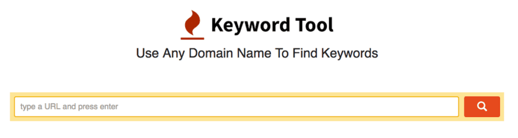
To find good keywords, just go to KeywordTool.io and enter your primary keyword and search for it. You’ll get a list of keywords to target in your pages.
Alternatively, enter your competitor’s website address and search for it. You’ll see all the keywords they’re targeting, so you can do the same or find an opportunity to rank higher in the organic search results.
4. KISS – Keep It ‘Silly’ Simple
If you don’t want to overwhelm people when they visit your website, then you have to declutter your header, sidebar, and footer. Every section of your website must be clean and simple.
When you have too much information on the page, you’re making it difficult for visitors to find the right information that will improve your bottom line.
There’s no need to include everything on a page. Great web design means cleaning up your pages so that unnecessary elements don’t get in the reader’s way.
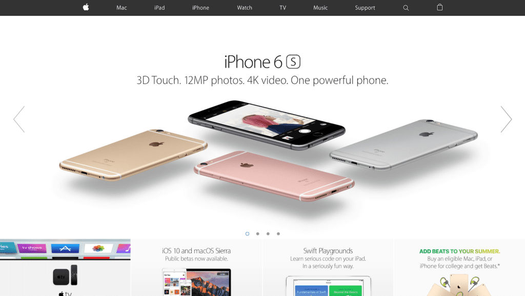
As huge of a brand as Apple is, its website is still the most simple that I’ve ever seen. The simplicity makes a huge impact on buyers — as you can see from Apple’s market share.
A simple website follows a similar trend as the Hick’s Law — a popular theory that plays a key role in terms of web design. Here’s what the law says:
“The decision time increases when you increase the number of choices.”
The decision time increases when you add too many elements above the fold of your website.
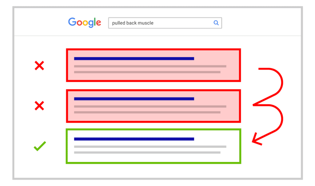
A cluttered page, with buttons and links to click, can annoy the visitor and lower their interest level altogether. You don’t want a website like this:
In this respect, the right approach you can adopt to boost your website conversions is by placing the most important elements where they can be easily seen.
For example, if you want visitors to buy your new book, then place it above the fold with a link to the online store. If it’s subscribers you want, then position it properly.
Every other element, such as testimonials, customer reviews and ratings, blog posts, upcoming events, and services can appear in the navigation menu bar or well laid out just below the fold section.
5. Adopt the F-Layout in Your Website Design
As much as creating a professional website is important, the order and location of the elements and content shouldn’t be ignored.
You have to be deliberate about these. Web visitors read the page from left to right, and from top to bottom.
When designing your page layout, you have to consider the way the visitors are most likely to read the page. What pattern are they going to use?
The majority of the world’s population read content from top to bottom. Therefore, focusing on this pattern can help you position the important elements where the reader’s eye gaze is likely to go will make the difference.
That’s why creating a visual hierarchy of your page is a good practice. It’ll act as your wireframe, and will help you to place CTA in the most engaging locations for them to convert.
A study conducted by the Nielsen Norman Group which involves examining the reading pattern of 232 users who viewed thousands of different pages. The study revealed that people’s reading behavior is relatively consistent — the F-pattern!
The F-Pattern is the way we move our eyes when reading content online. Our eyes can scan the page, identify images, and read tiny texts all in a matter of seconds.
If you install a heat map software on your website, you’ll notice that after a few days or weeks that the visitors’ reading behavior (F-pattern). This illustration shows how the eyes move from (1) to (2) to (3) to (4) to (5).
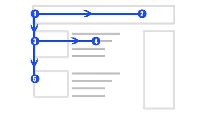
This is an interesting study, but you need to put it to work by using it in your web design strategy to boost conversions.
Having known where the visitor’s eye goes to, you can place the most important content and call-to-action within those F-layout screen sections.
This strategic approach can get you more conversions because you’re emphasizing the elements that matter most to your business.
6. Create a CRO Strategy Based on Data
If you’re already using analytics tools such as Google Analytics or any third-party tool, you can use the wealth of data to improve your website conversion.
Before creating a conversion rate optimization strategy, you will need historical data about users on your website.
This insightful data can come in handy when redesigning your website or starting a new website in a similar niche.
In your Google Analytics dashboard, look at the behavior flow report to get an idea of your target audience.
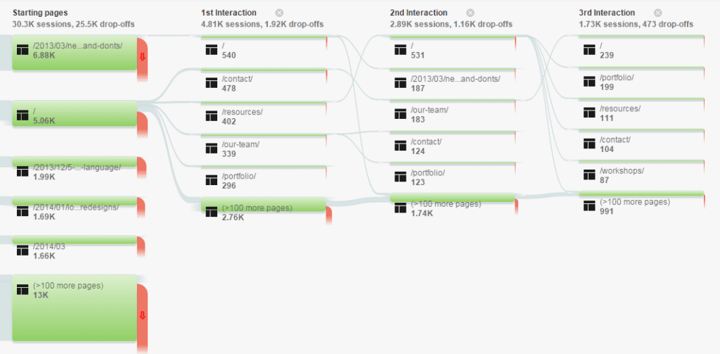
The behavior flow report is one of the most important metrics you should understand when using Google Analytics. Because it defines everything you do, the type of content you choose to create, which content pages to revise, and so on.
The behavior flow report shows which pages people are engaging as well as pages that cause people to bounce from your website.
This data alone is sufficient when you’re looking to create the best content that will help your audience.
If you want to drive traffic, engage people with your blog, and increase sales conversion, then you should study the best-performing content and do more of them.
On the flip side, analyze the pages that piss readers off, then rewrite it, make the page more useful and actionable, or take it down do a 301 redirect to another page that’s getting you traffic.
7. Design for Readability
Your website is often the first point of contact between you and your audience. People want helpful information but they want to be able to read it.
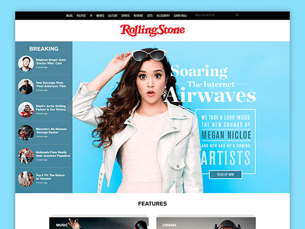
So readability matters a lot. Although RollingStone uses a combination of different fonts, it’s readable and clean.
Remember that people are impatient. They don’t want to waste time on a website that’s difficult to navigate, online consumers, in particular, are much smarter these days.
They can switch from one online store to the other if they’re not enjoying the process.
To keep these searchers coming back for me, you have to prove it with good design. If your content lacks plenty of white space and cluttered with so much information, it’ll be a huge turn-off for readers.
One of the proven ways to optimize your website design is through line length and spacing.
Choose clean fonts that aren’t overlapping in any way. Set the right margins or text frames — that way your content will stay intact in a fixed space.
8. Use Relevant Call-to-action Buttons
There’s no fast rule to follow when using call-to-action buttons. Because what works for one website may not work for another website, especially if they’re in different industries.
Generally, though, relevant CTA buttons always outperform creative and pushy buttons.
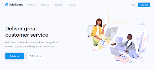
HelpScout uses “Get Started” in one of their CTA buttons because that’s exactly what the user will get when they click it.
You should be relevant in your communication that trying to be creative and lose the juice of your message.
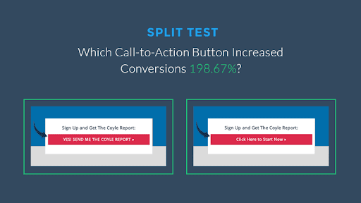
When you’re in doubt, test out your CTA buttons to find out the best-performing one for your homepage, landing pages, or services page. Leadpages split tested their CTA buttons and Version A increased conversions by 198.67%.
So, if you want people to opt-in and download an eBook that will help them to drive traffic, a relevant phrase on your CTA button will work. For example:
Download Free Ebook Now
Being creative dilutes the purpose for which you’re asking site visitors to opt-in.
So, using a phrase such as “Unleash Web Traffic” may sound captivating but it’s not relevant. Most marketers will ignore it, especially if you’re in the B2B industry.
But you can be relevant and creative at the same time. All you have to do is to the word, “Yes” at the beginning of your CTA button, this simple hack will project the offer you’re giving away in a positive light.
Here’s a good example from the WishPond blog:
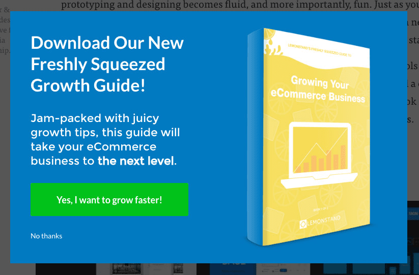
Note: The screenshot above is an exit-intent popup that you can integrate with OptinMonster, OptiMonk, and several other software tools.
9. Optimize Your Website Speed
Website speed is arguably an important factor that creates a good user experience. Even if your design isn’t so colorful, as long as your pages can load up quickly, you’ll still drive organic traffic.
Google and other search engines want to satisfy the searcher with helpful results.
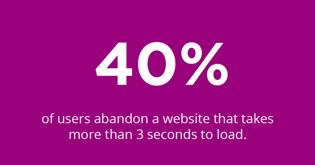
If your web page shows up on Google’s first page but doesn’t load up within 3 seconds after the searcher lands on the page, they’ll bounce.
According to research, 40% of visitors to your site will abandon it if the page is still loading after 3 seconds.
This concept is known as pogo-sticking — a situation whereby a searcher lands on a page, but due to several reasons (irrelevant content, broken links, slow site, non-responsive page), they click the back button and go back to the search results to choose a different option.
If you were ranking at the number #2 position, for example, there’s a chance that Google will push your page down or in worst cases, remove it from its index.
Optimize your website to load up quickly. Don’t waste people’s time on your site. According to research, a 1-second delay in your website’s loading time can cost you up to 7% in the conversions. You don’t want that, do you?
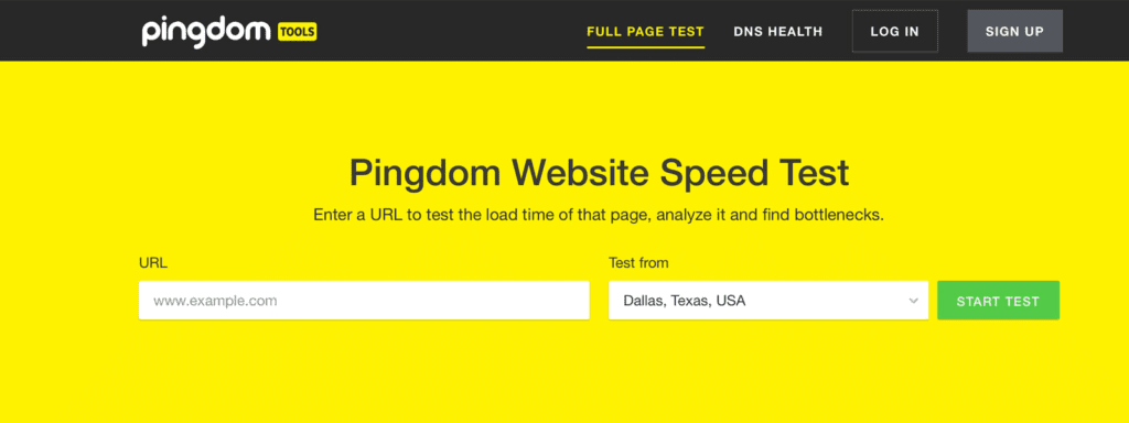
When it comes to speed, every second is important. Check your site speed with the Pingdom tool, and if it’s more than 3 seconds, you’ve got work to do.
Since we’re optimizing our pages for search users as well, use the Google PageSpeed Insight tool to analyze your page speed and size, then follow the suggestions to optimize for speed.
10. Embed Video on Your Website Design Homepage
You might have noticed the new video trends for web design. In the past, businesses used stock photos of happy people.
But savvy businesses have learned that videos can do a lot more. Since the human mind is wired to relate to video content better, you should incorporate it on your homepage.
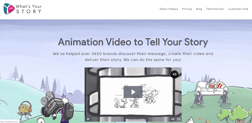
YDraw uses explainer video on its homepage, which goes to show that any type of video can work.
Your homepage can act as a standalone landing page where you connect and welcome your potential customers. You also use the homepage to create awareness about your products and services.
Rather than using infographics, charts, or stock photos on your website, you should try a video — especially if you’re a SaaS or service-based company.
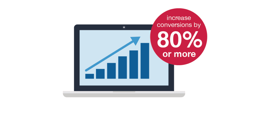
Videos bring life to your landing pages and people can’t get enough of it. According to a survey, embedding a video on your landing page can increase the conversion rate by 80%.
Why is video content so powerful for increasing conversions?
Well, a video can tell the brand story better than static images or written copy. People can get emotionally attached to your website/brand after watching your video, which creates an opportunity for conversion.
11. Choose the Right Colors for you Website
You can use the right colors to educate, inspire, and persuade site visitors to take action. Color is one of the most striking aspects of web design. It plays a key role in site usability and user experience.
“Colors can convey the overall meaning of your brand and highlight the brand’s tone,” says designer Ludmila Shevchenko.
A combination of different colors can evoke strong emotions and reactions from your target audience. So choose your colors wisely because it’ll affect your conversions.
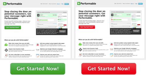
A B2B company tested the green CTA button against the red button. After running the test for a few days, the team discovered that more people clicked on the red button. The red button performed better and increased conversions by 21%
You also need to understand an aspect of color psychology. The truth is that different colors denote different meanings — and this could impact how a particular demographic or people of belief view it.
So endeavor to choose colors that will portray the true meaning of your brand. If you choose to adopt the Pink color on your website, for example, then your business or product has to be fun, playful, romantic, and above all, feminine.
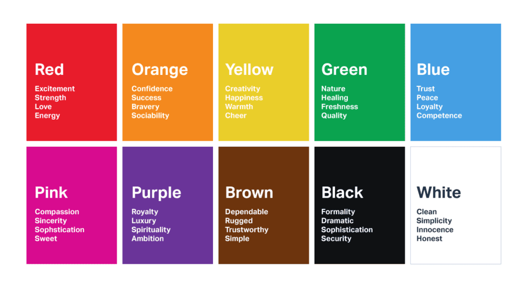
The Red color, on the other hand, symbolize passion, determination, power, strength, and in extreme cases, danger or war.
Don’t get me wrong. Feel free to use any colors you want. If you have favorite colors, you can combine them in your web design as well.
But it’s always wise to get to understand what these colors mean. Being ignorant of their significance is the problem.
Conclusion on Website Design
Great web design is fundamental to the success of your online business. However, you need to go beyond that. In conclusion, I want to just give you a bunch of Websites and landing page designs that you can look over.
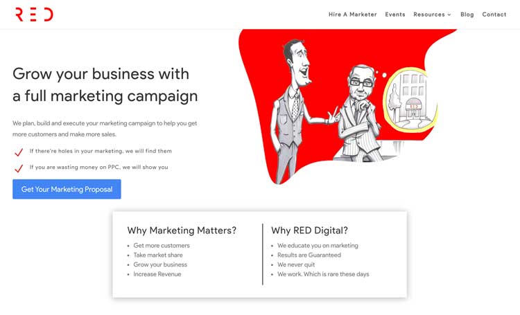
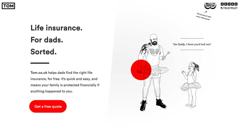
These are some that we have Built at RED Digital. We like to stand out and keep them very simple.
Suppose two or more companies in the same industry have the best web design ever, what do you think will make the difference at the end of the day?
“Content.”
So while you’re spending money on the best web design firm in your city or online, you should also invest in high-quality content.
And if you already have quality content but your design is bad, it’s time to fix that.
Do you have a lot going on in your navigation menu bar? Is there a personality on your website? These are simple tweaks you can make today!
To ensure you’re fixing the right things on your website design, you might want to run a conversion rate audit. Our team can help you if you don’t know how to get started.